Creating Since 2013

JOSHUADEAKIN

Multimedia Designer with 12+ years across branding, motion, print, and digital. Based in Glasgow, Scotland.

SCROLL
About

Designing with purpose since day one.

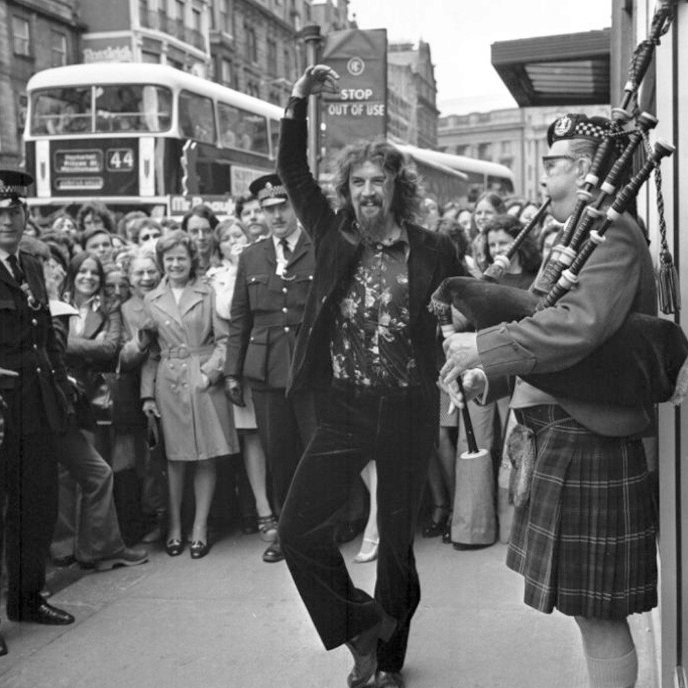
It started with a game case. I was 14 when Saints Row caught my eye — not the game, the cover. A skyline built from firearms that told you exactly what you were in for before you'd even opened the box. That moment of realising design could do that — communicate a whole world in a single image — never really left me.

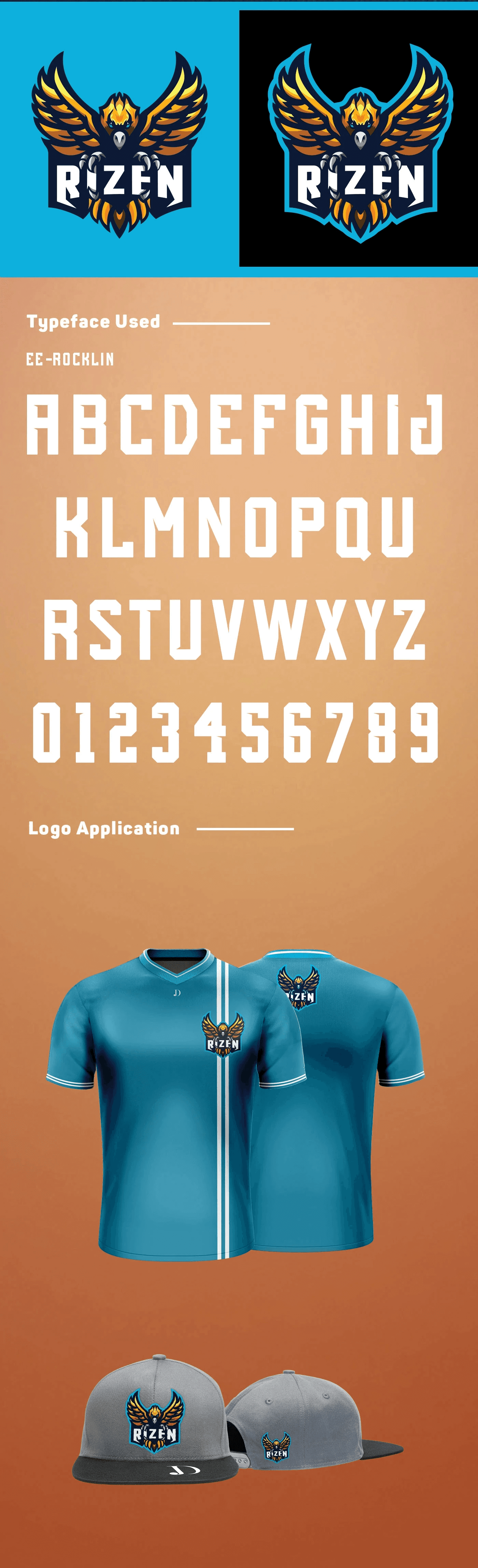
I studied Graphic Design at City of Glasgow College, and while most students were building hypothetical portfolios, I was already working with real clients — designing mascot logos for eSports teams, learning that deadlines and difficult briefs are where you actually grow.

Outside the studio I'm the kind of person who watches a show and then immediately falls down four hours of theory breakdowns about it. I pick things apart to see what makes them work — whether that's a film edit, a typeface choice, or whatever's new in VR. When I need to switch off completely, I get out on my Kawasaki and let Scotland do the rest.

That same curiosity is what I bring to every brief. I'm genuinely interested in why things look the way they do — and obsessed with making them look better.

LinkedIn Dribbble Download CV
Photos coming soon
12+
Years Experience
27
Brands Served
Tools & Software
Adobe IllustratorAdobe PhotoshopAdobe InDesignAdobe After EffectsAdobe Premiere ProClaudeChatGPTAdobe IllustratorAdobe PhotoshopAdobe InDesignAdobe After EffectsAdobe Premiere ProClaudeChatGPT
APMP
Current Role · 2023 — Present

Multimedia Designer at APMP

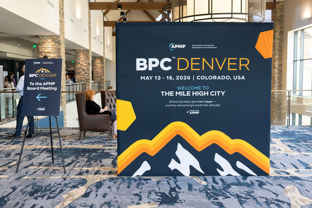
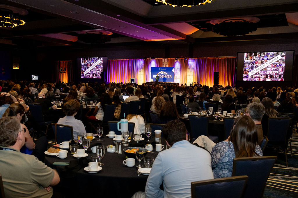
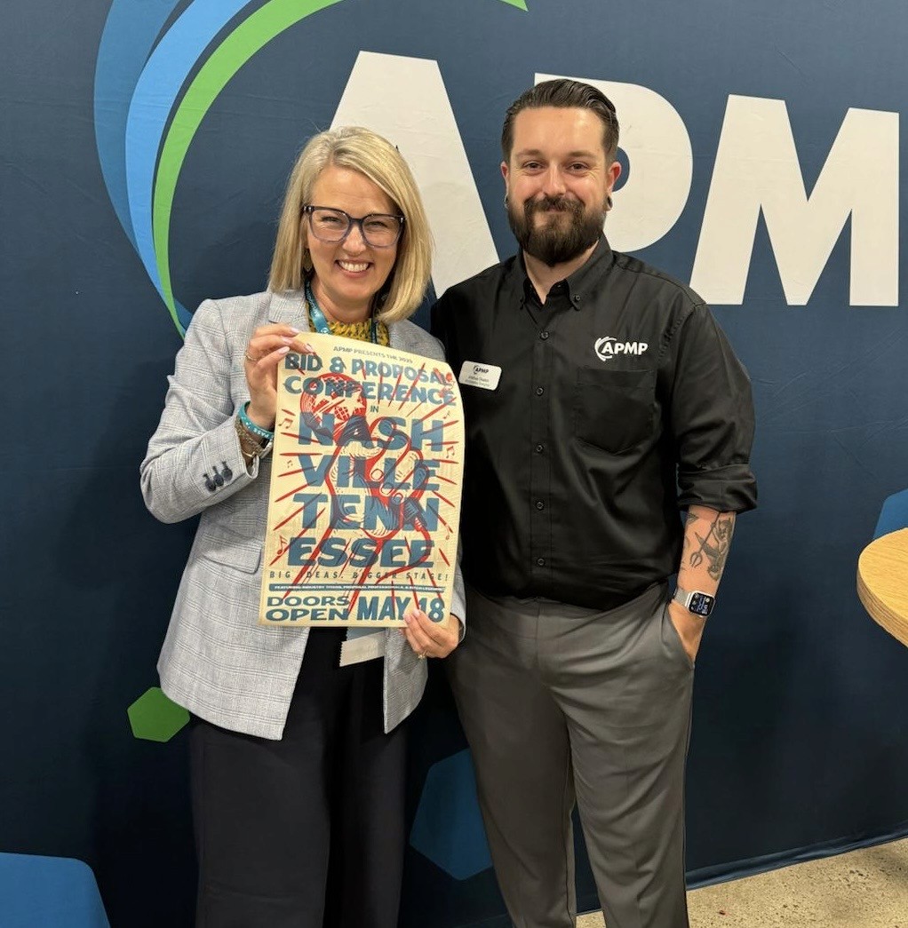
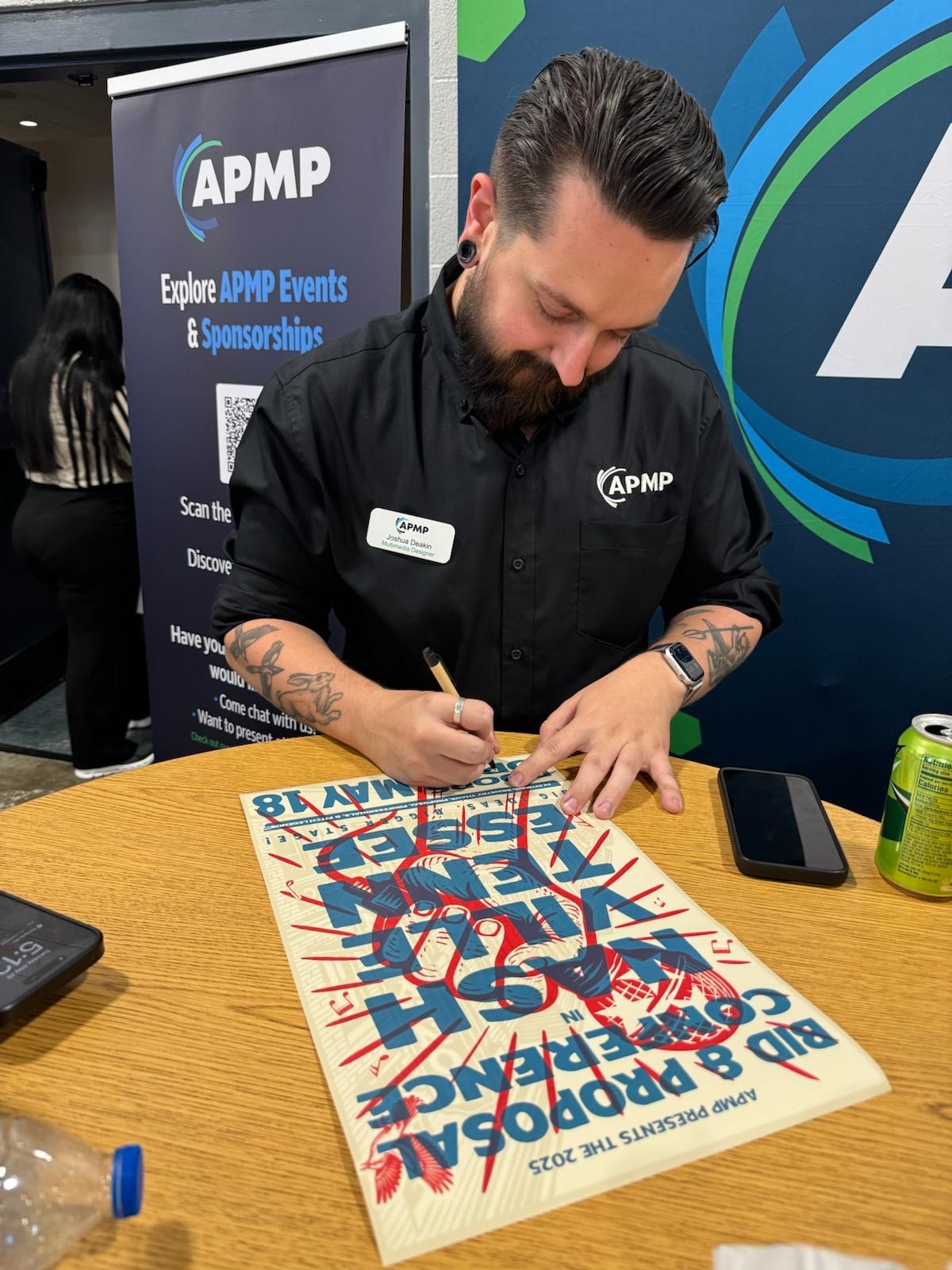
Working within APMP's marketing team, I collaborate across departments to bring the brand to life — from event logos and promotional assets to in-person signage and digital campaigns.

Together with the team, I help strengthen the member experience through how-to videos, visual content, and the APMP Knowledge Centre.
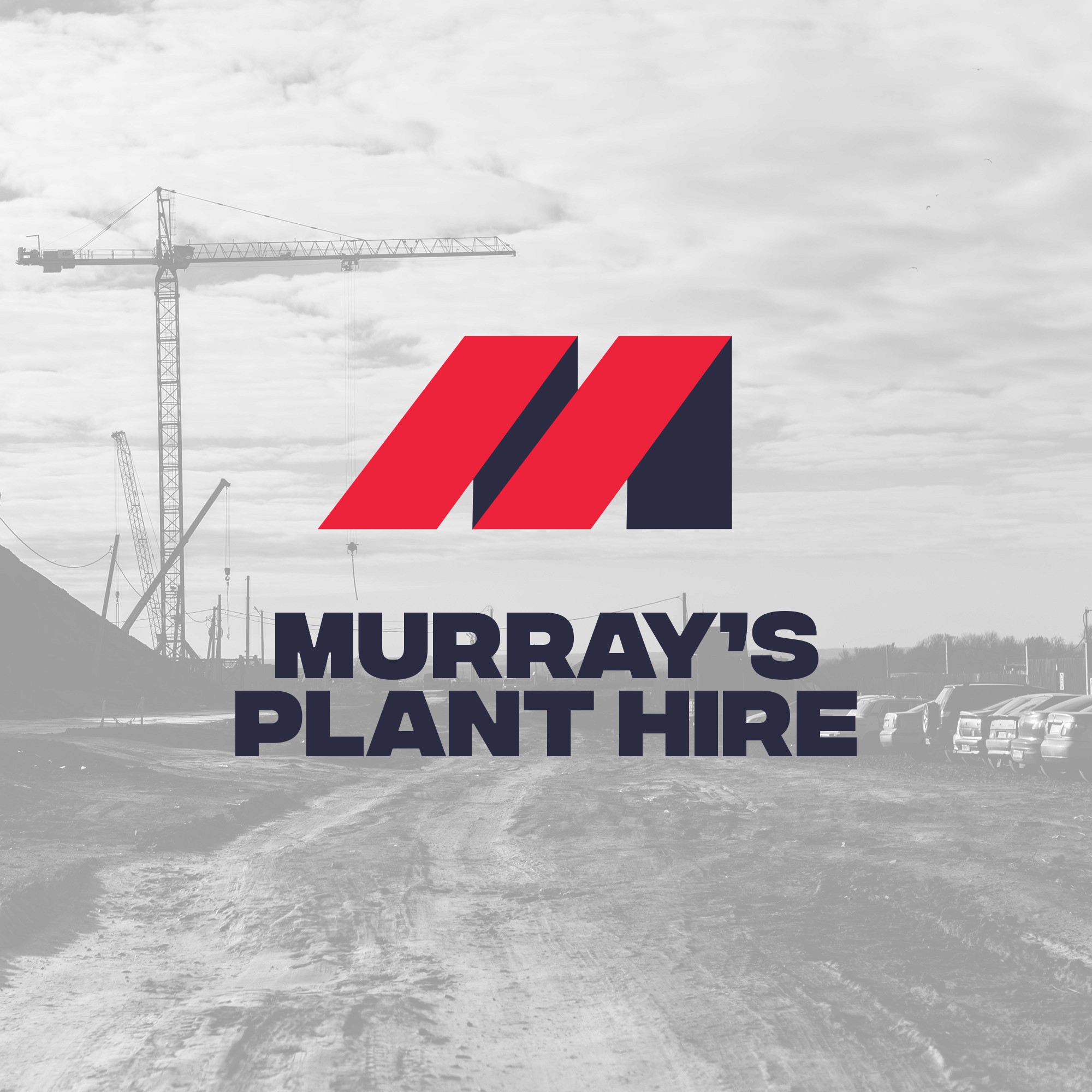
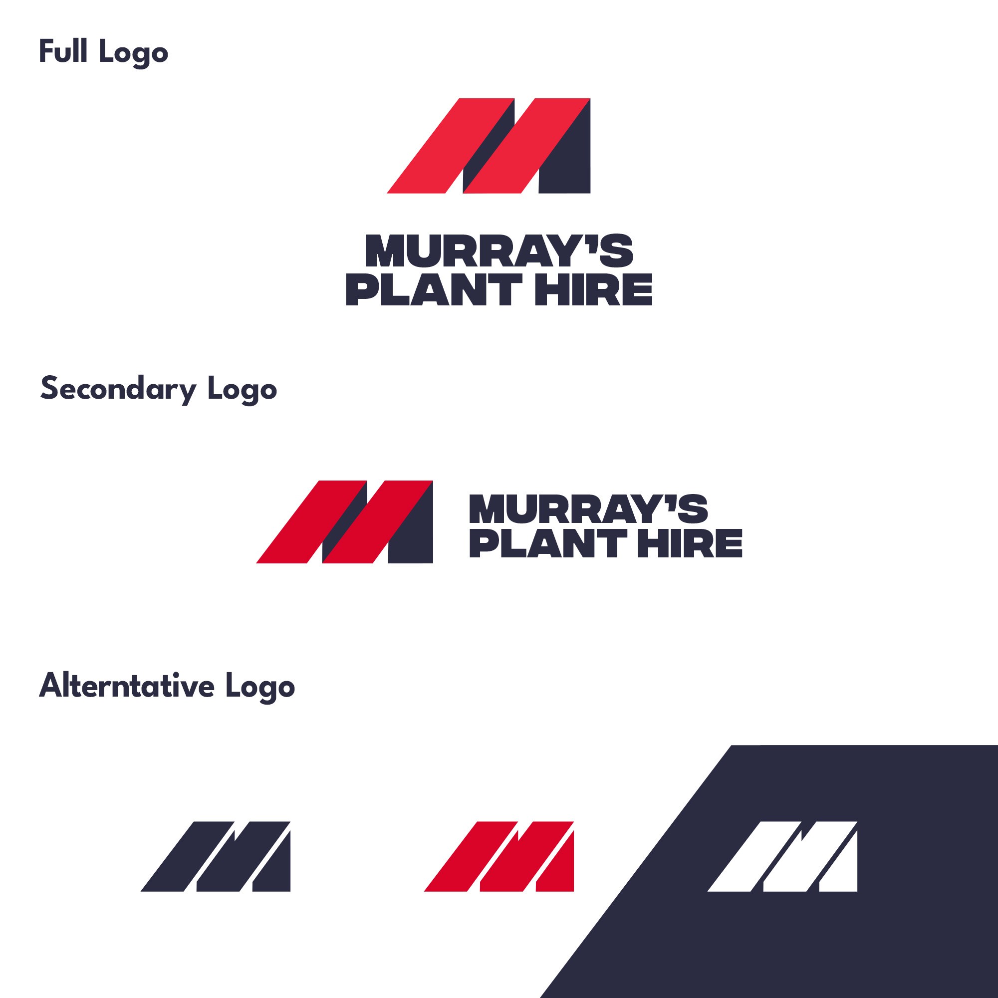
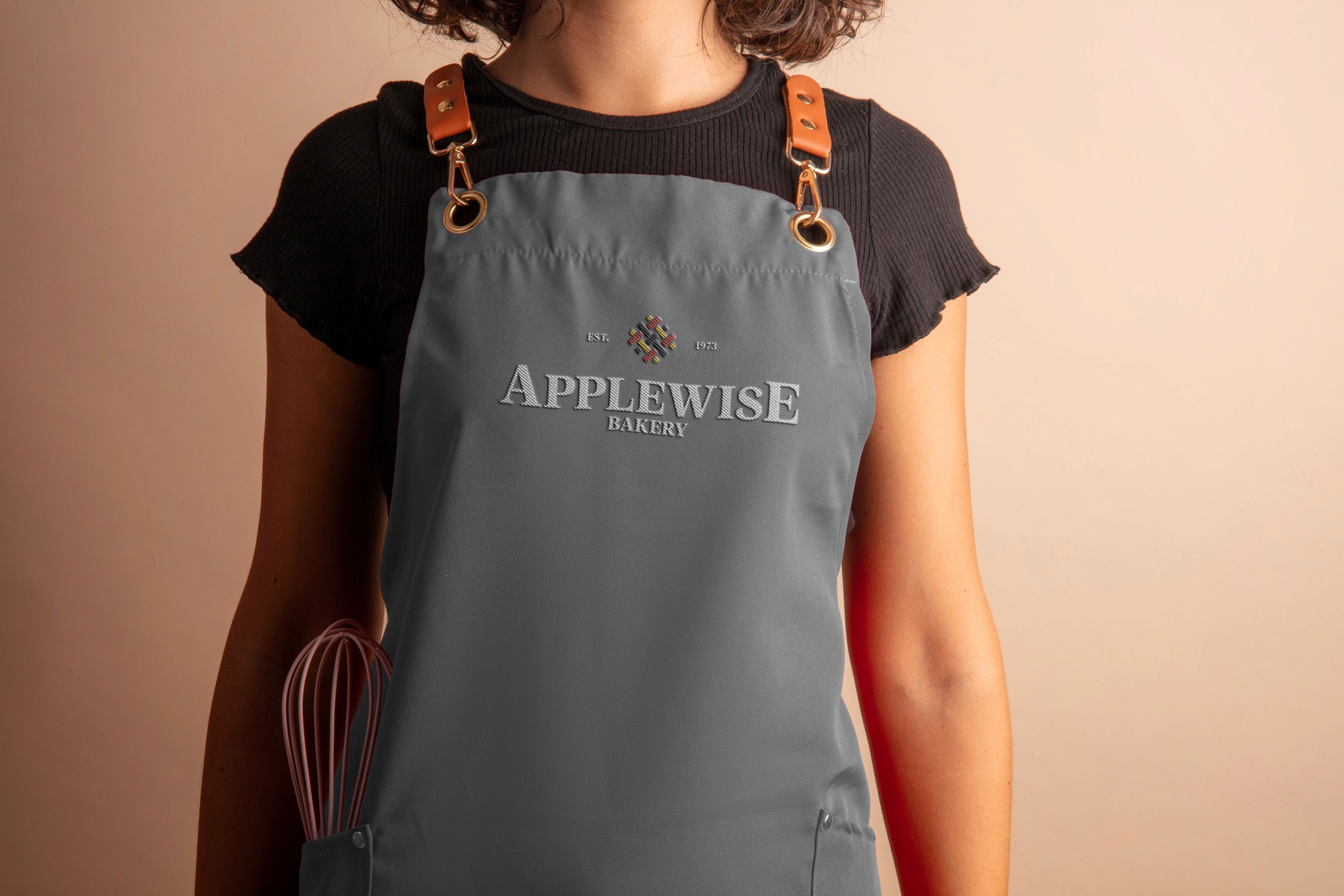
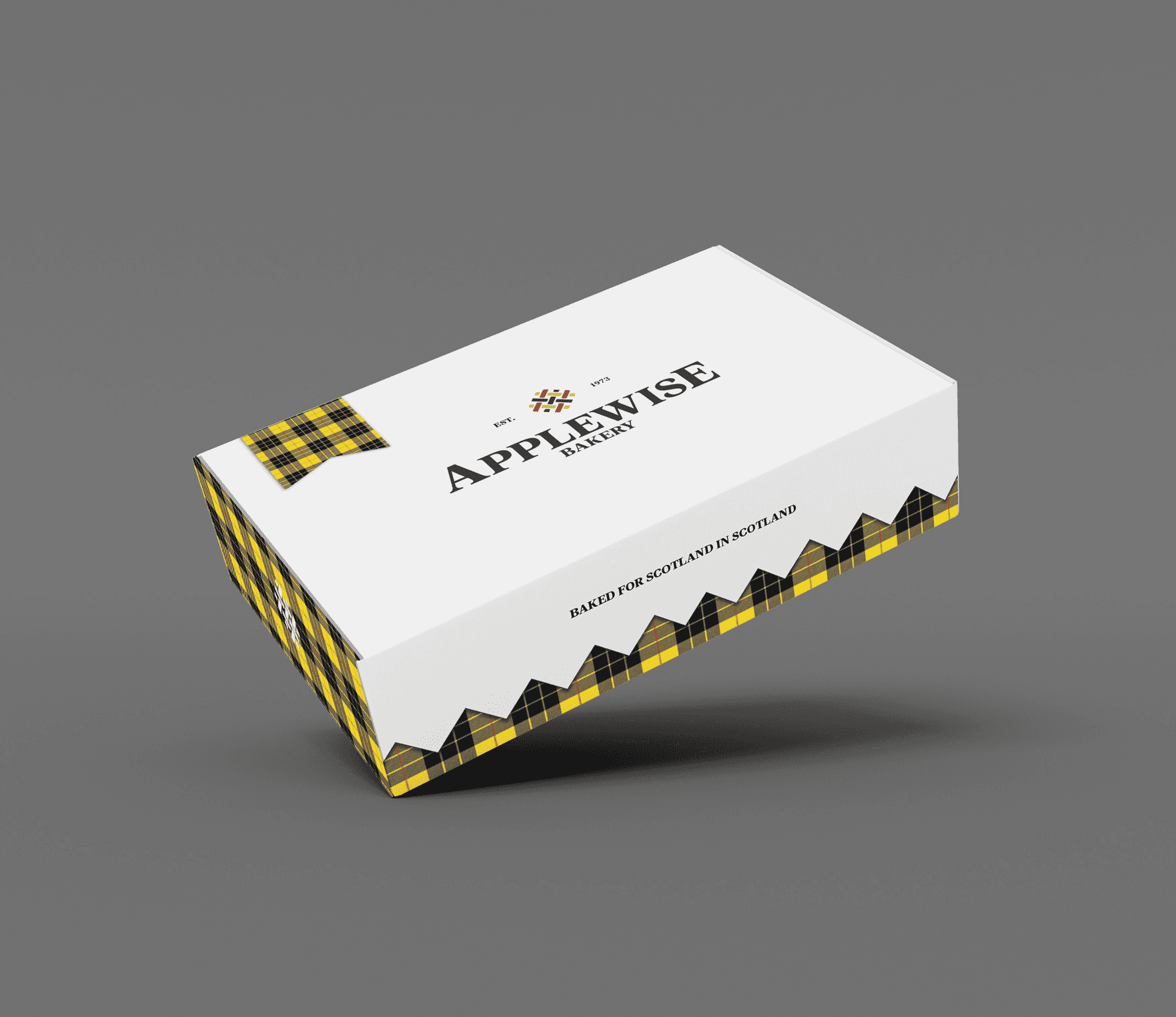
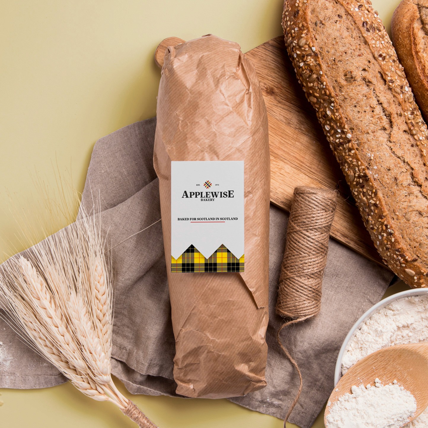
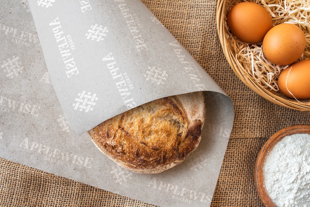
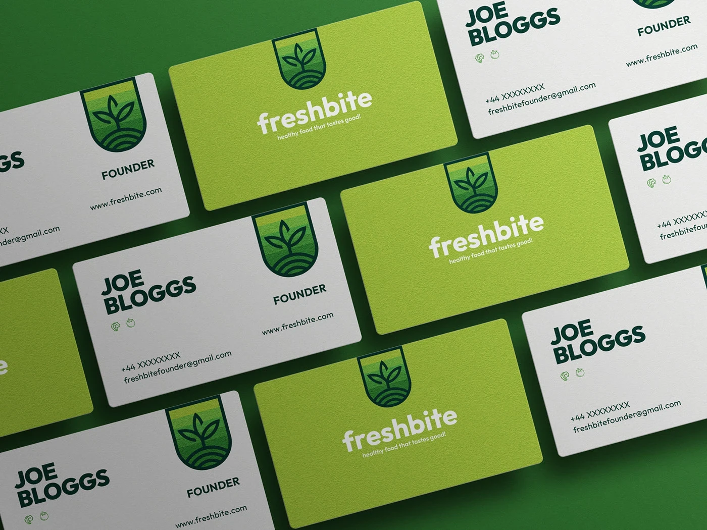
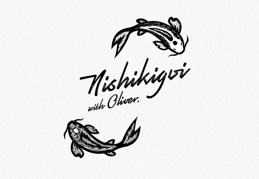
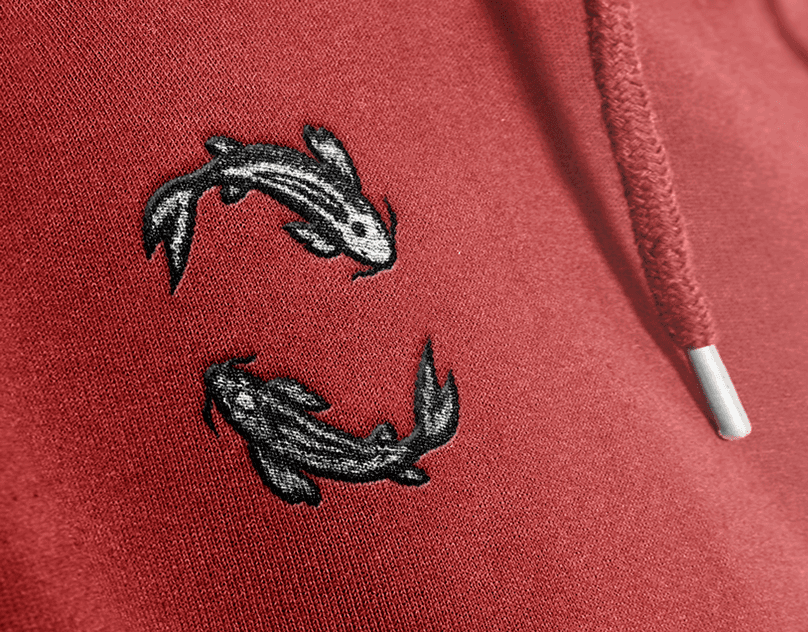
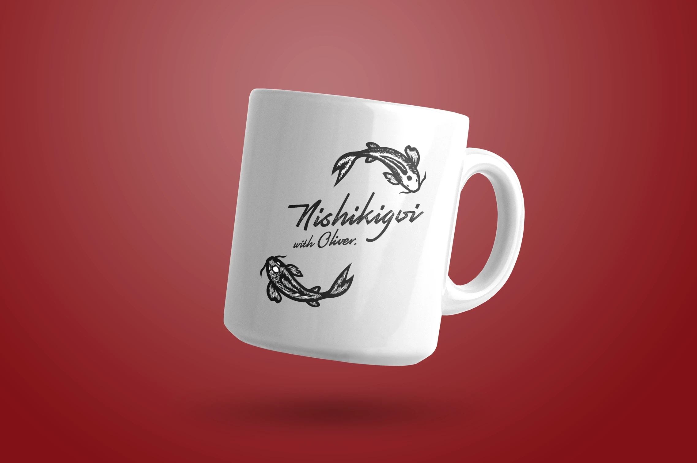
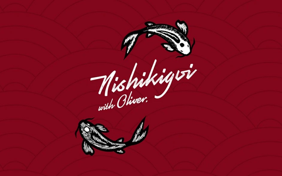
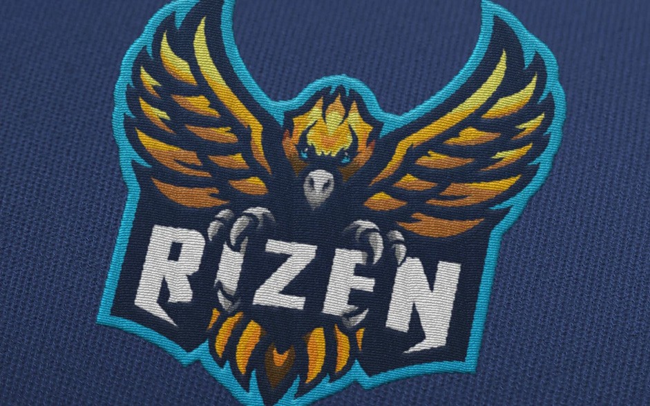
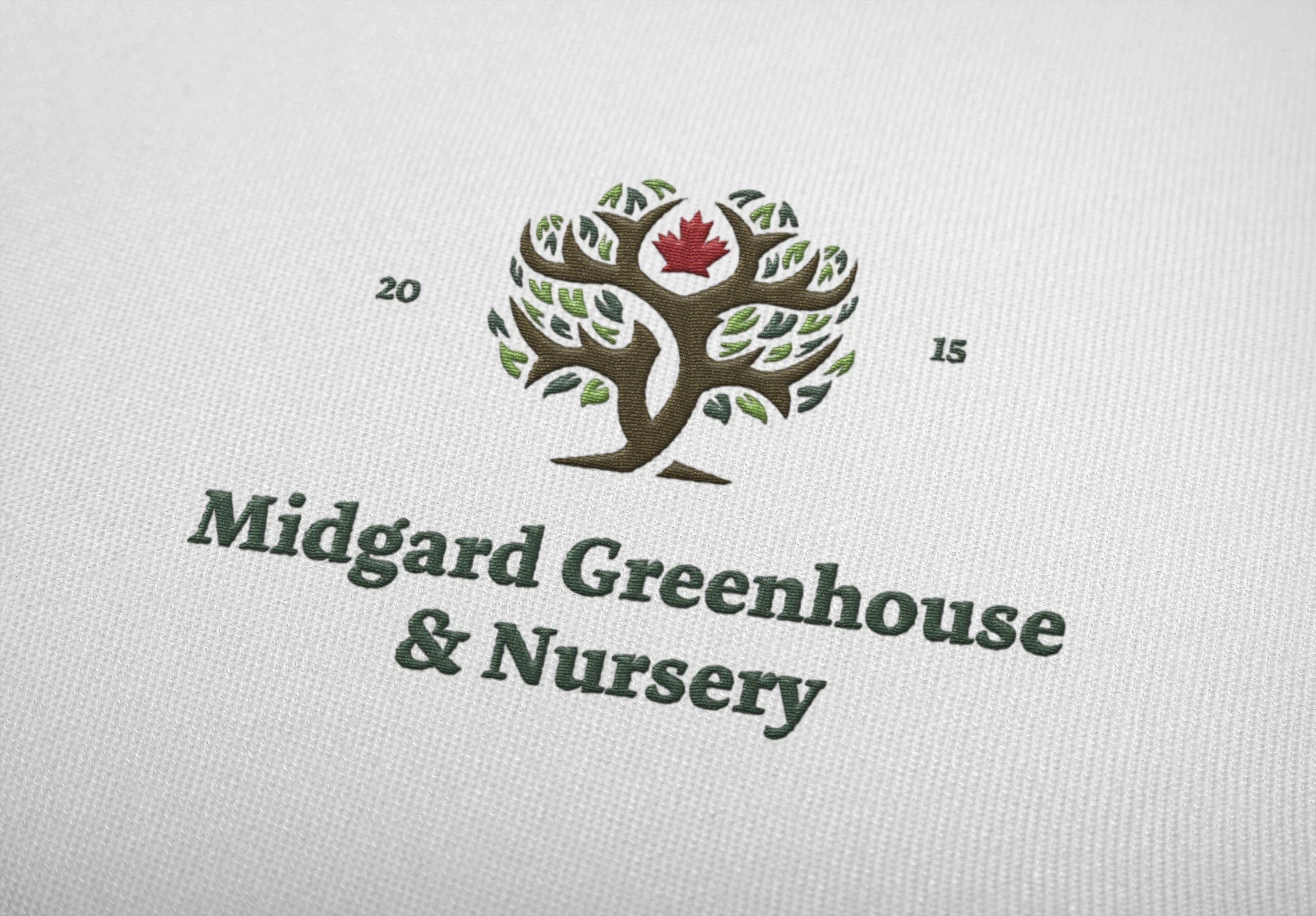
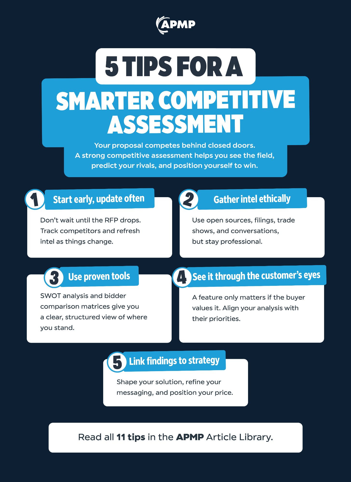
🥇 Gold Award — Advertising Media Kit
Association Trends · Mar 2025
Using Flipsnack, I developed an interactive, magazine-style sponsorship guide — winning Gold from Association Trends.
🥈 Silver Award — Membership Welcome Guide
Association Trends · Mar 2026
The APMP Membership Welcome Guide was recognised with a Silver award for its design and member experience impact.
Projects

Selected Work

Murray's Plant Hire Brand Identity Glasgow
Murray's Plant Hire
Brand Identity
Applewise Bakery Brand Identity Scotland
Applewise Bakery
Brand Identity
Freshbite Meal Kit Brand Identity Design
Freshbite
Brand Identity
Nishikigoi with Oliver YouTube Channel Branding
Nishikigoi with Oliver
YouTube Branding
Rizen eSports Logo Design
Rizen
eSports Logo
Midgard Greenhouse and Nursery Brand Identity
Midgard Greenhouse & Nursery
Brand Identity
Experience

Where I've worked

2023 — Present
Multimedia Designer
APMP
At APMP, when it comes to design, it all comes from me. From event logos, promotional assets, to in-person signage. I am also responsible for strengthening the member experience through how-to videos and the APMP Knowledge Centre.
2019 — 2023
Graphic Designer
Park's Motor Group
Created digital marketing assets for 27 brands, ensuring brand consistency while exploring creative possibilities. Specialised in web design, motion graphics, and branding using Adobe software.
2017 — 2019
Graphic Designer
David Urquhart Travel
Created brochures, flyers, and social media graphics that engaged thousands of customers, supporting the company's marketing strategy and strengthening its visual identity in the travel industry.
2015 — 2016
Freelance Graphic Designer
eSports
Specialised in illustration and branding, creating innovative and trend-focused designs for the eSports industry.
Contact

Let's talk.

Whether it's a project, a collaboration, or just a conversation about design — I'm always happy to connect.

Glasgow, Scotland
Full-Time Role · Multimedia Designer

APMP

Multimedia Designer · Remote · October 2023 – Present

APMP is where my creative skills are constantly in motion. My work spans video production, brochure and publication design, social media graphics, branding, and visual storytelling that supports APMP's global marketing and communications.

The work featured here represents the creative output of my day-to-day role — projects that balance strategic communication with strong visual design across digital and print platforms.

On The Record Podcast

An episode from APMP's On The Record podcast. I edited the episodes, branded the series, and grew the YouTube channel by over 100% in new subscribers.

Loading...
APMP · On The Record
BPC — Annual Event

A selection of images from APMP's two and a half day in-person event, BPC.

  • — 1,200 attendees
  • — Created the branding, signage, and promotional materials
  • — Including the poster I was asked to sign!
Membership Welcome Guide

Designed to bridge the gap between joining the association and discovering all the benefits unlocked as a new member.

🥇
Gold Award — Advertising Media Kit
Association Trends · Mar 2025

Using Flipsnack, I developed an interactive, magazine-style guide to showcase sponsorship opportunities with APMP — winning a Gold award from Association Trends.

🥈
Silver Award — Membership Welcome Guide
Association Trends · Mar 2026

The APMP Membership Welcome Guide was recognised with a Silver award for its design and member experience impact.

Infographics

A handful of the infographics created over the years. Used to reinforce that APMP is the profession leader and boost engagement on LinkedIn.

CLICK TO VIEW FULL SIZE

VIEW
VIEW
VIEW

Disclaimer: The work presented in this section was created by me or in collaboration with the APMP marketing team as part of my role as Multimedia Designer. All intellectual property and final ownership of these materials belong to APMP. These examples are displayed here solely for portfolio and presentation purposes.

Brief · Brand Identity

Murray's Plant Hire

Murray's Plant Hire had the reputation and the inventory — what it lacked was an identity that matched either. Operating in a trade industry where most competitors lean on clip-art logos and dated colour palettes, the brief was clear: build something that commands respect on a work site and holds up just as well on a business card.

Knowing the industry shaped every decision. The tone needed to be direct and hard-wearing — no softness, no excess. A brand that workers trust and clients remember.

The result is a versatile identity that works equally well on plant machinery, hi-vis workwear, signage, and digital — built to last as long as the equipment it represents.

0
Brand touchpoints designed
0%
Scalable across print, signage & digital
0 mark
Icon system built from a single core mark
The Brief
01
What they asked for
Stand out from the competition.

Murray's wanted to stand out. The plant hire sector tends toward the literal — tool iconography, trade-standard palettes, nothing that stays with you. The brief was clear: build something that commands attention.

02
What it really meant
Don't just look different — be smarter.

The industry default is to show what you do. The opportunity was to make people think about it instead.

Directions Explored
Ruled Out
Following the industry playbook

The sector has a default visual language — tool-based marks, trade palettes, logos that describe a service rather than represent a business. It communicates, but it doesn't stick. Going down that road meant blending in, which was the opposite of the brief.

↳ Ruled out — communicating what you do is not the same as being remembered for it.
Chosen Direction
A mark with multiple hidden readings

The M is geometric and ownable — but it carries more than one idea. The form is drawn from the threads of a wood screw, meaning repeated vertically, the mark produces a consistent thread pattern. Flip the negative space and a bolt emerges, nodding directly to electrical plant hire. One mark, three readings. The kind of thing you only notice once — then can't unsee.

↳ Chosen — because the best logos don't show what you do. They make you realise it.
"
The Call
The best industry logos don't show what you do. They make you realise it.

The bolt was never meant to hit you immediately. Neither was the screw thread. Both are rewards for looking — which is exactly the kind of brand Murray's needed to become.

Murray's Plant Hire brand identity design
Murray's Plant Hire logo design
Murray's Plant Hire brand assets
Murray's Plant Hire visual identity
Murray's Plant Hire branding on machinery
Brief · Brand Identity

Applewise Bakery

Applewise Bakery is a Scottish institution — rooted in Stirling, built on family heritage, and famous for its apple pies. But the brief wasn't about celebrating what they had. It was about making sure what they looked like matched what they stood for.

The challenge was navigating abundance. Scottish heritage, the MacLeod tartan, apple pies, artisan baking — so many directions, each pulling hard. The answer was restraint: one idea, executed completely.

Combining the lattice pattern from the top of a traditional apple pie with the MacLeod tartan produced something that was immediately distinctive and deeply meaningful — a logo that doesn't need explaining, but rewards those who look closer.

0
Brand touchpoints delivered
0 sources
Tartan & pie lattice fused into one mark
0%
Locally inspired — from Stirling to shelf
The Brief
01
What they asked for
A refreshed identity that told the whole story.

Applewise had the heritage, the product, and the artisan values. The brief was to bring all of it forward — Scottish roots, handcrafted quality, the apple pies they were famous for. Everything, visible, in one place.

02
What it really meant
Don't include everything. Find the one thing.

The real challenge wasn't how to show more — it was how to reduce. A stronger identity wouldn't come from accumulation. It would come from finding the single idea that contained everything else.

Directions Explored
Ruled Out
Five directions. Five dead ends.

Five routes were explored in full. Heritage-led (tartan shield, Scottish crest) communicated origin but buried the product. Product-led (illustrated pie) was clear but flat — nothing to make it stick. Craft aesthetics (rolling pins, wheat, rustic type) felt borrowed. Combining everything — tartan, pie, thistle, apple — answered the brief literally and failed it creatively. A modern minimal mark was clean but had no story. Each direction worked on its own terms. None unified the brand.

↳ Ruled out — the right answer wasn't in any single direction. It was between two of them.
Chosen Direction
Two ideas. One mark.

The apple pie lattice and the MacLeod tartan share the same underlying geometry — a repeating grid of interlocking lines. Overlaid, they don't compete: they become one cohesive form. Product and heritage, resolved into a single mark that needs no explanation, but rewards the eye. The answer wasn't to include more. It was to find where two things were already the same thing.

↳ Chosen — because the best solution doesn't add elements together. It finds where they already overlap.
"
The Call
The brief asked for everything. The mark says it all — in one shape.

Five directions explored, each capturing something real. The answer came from stopping the accumulation and asking a different question: not what to include, but where two things were already the same thing. The lattice was always the tartan. The tartan was always the pie.

Applewise Bakery brand identity design
Applewise Bakery logo and packaging design
Applewise Bakery logo variations
Applewise Bakery storefront branding Scotland
Brief · Brand Identity

Freshbite

The brief presented a meal-kit company that had lost ground to newer, more visually confident competitors. Sales had plateaued and the existing identity felt dated — failing to connect with the health-conscious, design-aware audience they needed to reach.

The challenge was to build a brand that felt premium without feeling cold — grounded in nature, but modern enough to sit confidently alongside the best in the category.

The visual direction leans into organic warmth: natural colour, fluid form, and considered typography that signals quality from first glance.

0%
Est. uplift in perceived brand quality
0 weeks
Concept to final delivery
0
Brand touchpoints developed
The Brief
01
What they asked for
Modernise the identity to compete with newer brands.

Freshbite had lost ground to more visually confident competitors in the meal-kit market. The brand felt dated, and the brief was to bring it up to date — make it look current, appealing, competitive.

02
What it really meant
Rebuild the emotional connection the brand had lost.

The problem wasn't age — it was disconnection. The brand no longer felt relevant to the health-conscious, design-aware audience it needed to reach. The real task was repositioning: premium and contemporary, but warm and human. Not just modern. Trustworthy.

Directions Explored
Ruled Out
Every route solved half the problem.

A corporate minimal approach looked premium but felt sterile — disconnected from the warmth food needs. A loud, freshness-led direction had energy but risked cliché. Ingredient-led visuals grounded the brand in product but removed distinction. Illustrative and overly organic routes introduced warmth but compromised the sense of quality. Each direction got one thing right and sacrificed the other.

↳ Ruled out — premium and natural kept pulling against each other. The answer had to hold both.
Chosen Direction
Organic warmth with enough restraint to feel premium.

Rather than choosing between refinement and warmth, the final direction integrates both. Natural colour palettes, fluid forms, and considered typography create a visual language that signals quality without rigidity. The brand feels approachable and human — but confident enough to sit alongside the best in the category. Premium without the cold.

↳ Chosen — because freshness and quality aren't opposites. The right visual language carries both.
"
The Call
Premium without the cold. Natural without the cliché.

Every competitor had picked a side: clinical and polished, or loose and earthy. The opportunity was the space between — a brand that felt like quality and warmth existed at the same time, not in spite of each other.

Freshbite meal kit brand identity design
Freshbite brand logo and typography
Freshbite packaging design
Freshbite brand colours and design assets
Freshbite brand application mockup
Brief · YouTube Branding

Nishikigoi with Oliver

The brief came from a channel that had been quietly growing its audience without any cohesive visual identity — thumbnails were inconsistent, there was no logo, and the brand had no presence beyond the content itself.

The goal was to create a visual identity that felt authentic to the hobby — refined but accessible, with a warmth that matched Oliver's personality on screen.

From logo to thumbnail templates, every element was built to scale with the channel and give it the kind of visual confidence that converts casual viewers into loyal subscribers.

0%
Subscriber growth post-rebrand
0
Brand assets delivered
0 weeks
Turnaround from brief to launch
The Brief
01
What they asked for
A logo and consistent thumbnails.

The channel was growing, but looked like it hadn't noticed. No logo, inconsistent thumbnails, no visual thread connecting any of it. Oliver needed something that made the channel look like it meant business.

02
What it really meant
Build a brand that makes viewers stay.

The content was already good — what it needed was a visual identity that matched it. Something that reflected Oliver's personality, built trust with an audience who knew their subject, and made the channel feel like a place worth returning to.

Directions Explored
Ruled Out
Polished, personal, or flexible — pick one.

A corporate-style identity looked professional but felt wrong — too detached for a passion-led channel. Heavily illustrated koi-focused marks were expressive but risked feeling decorative over functional. A thumbnail-first system prioritised click-through but lacked brand depth. A purely minimal approach gave flexibility but offered no character. None of the single-focus directions captured both the subject matter and the person behind it.

↳ Ruled out — the identity needed to carry Oliver's personality as much as the content.
Chosen Direction
Refined, accessible — built around the person, not just the subject.

The final identity is grounded in the niche — koi keeping is a considered, patient hobby — but it leads with personality. Refined enough to feel credible, warm enough to feel human. The logo, thumbnail templates, and channel art all work from a single system, meaning the brand grows as consistently as the channel does.

↳ Chosen — because the audience trusts the creator first. The brand has to reflect them.
"
The Call
The audience already trusted Oliver. The brand just had to be worthy of it.

A niche audience is an informed one. They don't need convincing — they need to feel like the channel takes itself as seriously as they take the hobby. The identity gave the content the visual confidence it had already earned.

Nishikigoi with Oliver YouTube channel branding
Nishikigoi with Oliver logo design
Nishikigoi with Oliver YouTube thumbnail design
Nishikigoi with Oliver channel art
Nishikigoi with Oliver brand assets
Nishikigoi with Oliver visual identity
Nishikigoi with Oliver complete brand system
Brief · eSports Identity

Rizen

The brief was clear: a rising eSports team with real ambition but a visual identity that wasn't keeping up. Their existing mark was generic — forgettable in a space where identity is everything.

The direction centred on the phoenix — power, rebirth, and the relentless drive to come back stronger. The Rizen mark needed to feel earned, not templated.

Built through illustration-first thinking, every curve and edge was drawn to convey momentum. The result is a mascot logo that commands attention in stream overlays, merchandise, and social alike.

0%
Increase in social engagement post-launch
0
Logo variants delivered
0%
Custom illustration — no stock assets
The Brief
01
What they asked for
A stronger logo to match their ambition.

Rizen were a rising eSports team with the results to back it up and an identity that didn't. The existing mark was generic — forgettable in a space where recognition is currency. They needed something that looked like it belonged at the level they were heading.

02
What it really meant
Give them a symbol worth putting on a jersey.

In eSports, identity travels — stream overlays, merchandise, social, tournament broadcasts. The real brief wasn't a logo. It was a mark with enough story and presence to build loyalty, command attention, and still work at 16px.

Directions Explored
Ruled Out
Versatile, expressive, bold — but none of them stuck.

A minimal eSports wordmark was clean and scalable, but blended into an already saturated landscape. Typographic-led solutions prioritised legibility but lacked energy. High-detail mascot routes had intensity but often felt derivative — templated aggression rather than earned character. Abstract symbol approaches suggested strength but built no emotional connection. The space is crowded with marks that look powerful. Rizen needed one that felt meaningful.

↳ Ruled out — visibility without story is just noise.
Chosen Direction
A phoenix. Built from scratch, not borrowed.

The phoenix gave Rizen a narrative — rebirth, resilience, the drive to come back stronger. It aligned with the team's trajectory and carried meaning that generic aggression couldn't. The mark was developed through illustration-first thinking: every form drawn to convey momentum rather than assembled from stock shapes. The result is a mascot logo that commands attention on stream, merchandise, and social — and feels crafted, not templated.

↳ Chosen — because the best eSports marks don't look powerful. They feel earned.
"
The Call
The best eSports marks don't just look powerful. They feel earned.

Any team can commission aggressive typography or a sharp geometric mark. Rizen needed something that told a story — a symbol that made sense of the name and gave fans something to believe in. The phoenix did that without needing explanation.

Rizen eSports logo design
Rizen eSports brand identity and mascot logo
Brief · Brand Identity

Midgard Greenhouse & Nursery

Midgard had been trading for years on reputation alone — no logo, no consistent visual language, and nothing that could carry the brand beyond word of mouth. As the business grew, the absence of identity was starting to hold it back.

The brief called for something that could live everywhere: embroidered onto staff uniforms, printed on grocery bags, flying as a flag at the premises. That scope shaped every decision.

The identity draws on Nordic mythology — grounded, considered, and built to last. Clean enough for everyday use, distinctive enough to be remembered.

0
Touchpoints designed across print & merch
0 logo
Scalable mark — works at any size
0%
Remote delivery — client based in Canada
The Brief
01
What they asked for
A logo for a business that had outgrown word of mouth.

Midgard had been trading for years with no formal identity — no logo, no visual language, nothing to carry the brand beyond reputation alone. As the business grew, the absence was starting to show. They needed something to match where the business was heading.

02
What it really meant
Build a system, not just a mark.

The identity needed to exist everywhere at once — embroidered on uniforms, printed on grocery bags, flying as a flag. That scope shapes every decision. A decorative mark wouldn't survive it. What was needed was something clean enough to scale, distinctive enough to last.

Directions Explored
Ruled Out
Warm, minimal, illustrative — each fell short of the brief.

A rustic garden-centre aesthetic felt familiar but generic — the kind of thing you forget before you leave the car park. A highly modern minimal identity was versatile but disconnected from the grounded, natural qualities of the business. Illustrative, nature-heavy directions captured the environment but became decorative and difficult to embroider. A typographic-only solution was simple but unmemorable. Each direction addressed function or character — none addressed both.

↳ Ruled out — the mark had to work on a flag and a uniform label at the same time.
Chosen Direction
Nordic mythology as a foundation — enduring, distinctive, grounded.

The name Midgard — the world of humans in Norse mythology — pointed toward something more than garden-centre convention. Nordic mythology provided a conceptual frame aligned with nature, strength, and longevity, while offering a genuine point of differentiation. The mark that emerged from it is simple enough to embroider, clear enough to read at any size, and distinctive enough to be remembered. Character and practicality, in one system.

↳ Chosen — the name already said something. The mark just had to live up to it.
"
The Call
The name already had a story. The identity just had to be worthy of it.

Midgard isn't a made-up word — it carries weight. The brief was to build an identity that matched that weight: grounded in meaning, built to last, simple enough to go anywhere. Norse mythology gave that without needing to be explained.

Midgard Greenhouse and Nursery brand identity
Midgard Greenhouse and Nursery logo design
Midgard Greenhouse and Nursery visual identity system
Midgard Greenhouse and Nursery merchandise design
Midgard Greenhouse and Nursery brand application
Midgard Greenhouse and Nursery complete brand system